
Context
As an in-house Product Designer at Budibase, I led the end-to-end UX redesign of the core workflow builder, the visual automation engine at the heart of the platform. Budibase is an open-source, low-code platform that enables businesses to rapidly build custom applications like customer portals, admin panels, and internal tools. Customers can run it self-hosted, keeping their data on their own infrastructure. The work had to support a wider strategic pivot: positioning Budibase as an AI-first automations platform, not just a better builder for today’s users.
The Problem
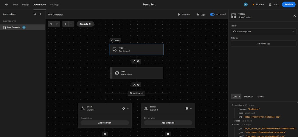
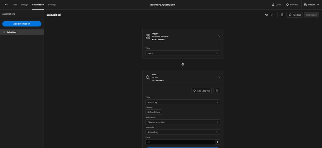
The builder worked, but you could not see your data. People could not tell what data was flowing into or out of a step, or even what they had selected in the tab they were in. Debugging was guesswork, errors did not explain themselves, and complaints kept landing in the community Discord, roughly eight to ten at a time on automations alone. It also left the product unprepared for the planned shift to AI-first automations, which depended on every step showing its data clearly.
What the Research Said
I designed and ran a paid Maze study with 25 active users. The task was blunt: go through the product and identify the most frustrating part. The pattern was clear. Data visibility and unclear errors came up repeatedly, along with a need for better debugging and testing tools.
I compiled the findings into a PDF and presented it to the Head of Engineering, the CMO, and the CEO. That evidence set the roadmap for the redesign and for the longer-term shift towards AI-first automations. The answer was not one-off UI fixes. It was a data framework where every step shows what goes in and what comes out.
What Shipped
| Improvement | Change | Benefit |
|---|---|---|
| Data In / Data Out | I added inline tabs to show the data flowing into and out of each step of a workflow. | Complete transparency for tracing data. |
| Inline Error Logging | I added a dedicated tab with clear error messages for any failed step. | Less guesswork, faster troubleshooting. |
| New Sidebar Panel | I moved workflow controls out of the main canvas and into a dedicated, contextual sidebar. | A cleaner canvas and a clearer editing experience. |
| Enhanced Canvas & UI | I added zoom and pan, and made the layout more compact. | Easier to manage large, complex workflows. |
What Happened
The complaints stopped. Before launch, automations drew eight to ten complaints and feedback requests on the Budibase Discord. After I shipped the redesign, that dropped to near zero. Clearer errors meant fewer people needed help in the first place.
What It Led To
Budibase later added an agents section, built directly on top of automations. Agents work because every step now shows and confirms the data coming in and out, allowing an agent to read that data and understand the context of what is happening. A new email arrives, an agent classifies it, creates a Jira ticket, and assigns it to the right team. The data in and data out framework made that possible, helping Budibase compete with AI workflow tools like n8n.
That structure is also how the product recovers when something is wrong. Inline error logging and visible data flow meant a failed step was something you could inspect and fix, not a black box. People needed that capability first, and agents later needed the exact same thing: if a step fails, show what went in, what came out, and what broke, then let a person confirm the next action.
At the time, I worked with ChatGPT and the AI tools available.
Outcome
Twenty-five users highlighted the core friction points. I presented that evidence to the executive team and redesigned the builder so people could finally see their data. That same structure went on to carry the agents feature, ensuring the AI platform Budibase became was built on workflows users already understood rather than starting from scratch.
