Context
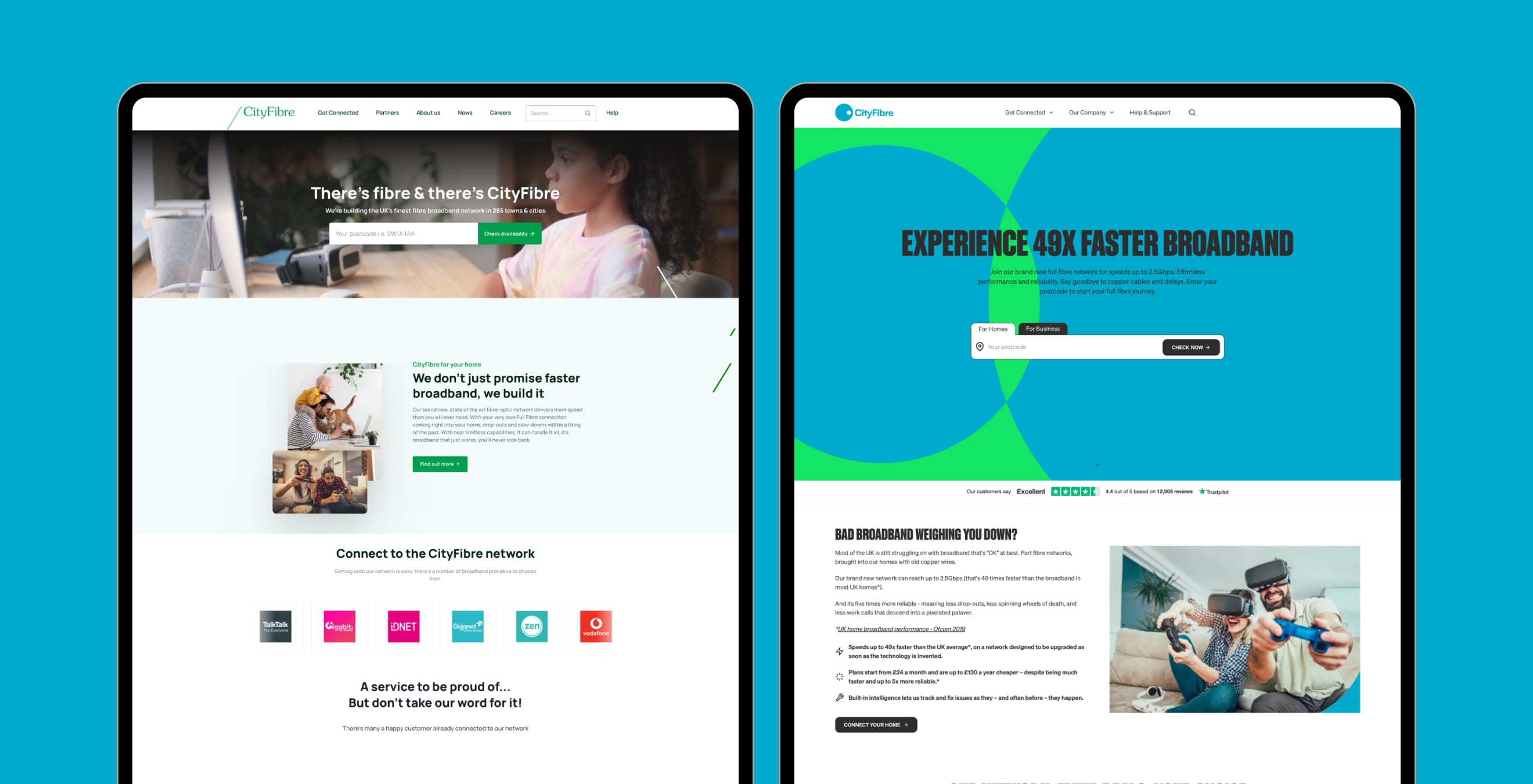
As lead designer on the CityFibre account at Dawson Andrews, I owned the digital rebrand: marketing website, backend portal, campaign landing pages, company emails, and other digital touchpoints. CityFibre is the UK’s second-largest fibre broadband infrastructure provider, installing fibre into homes and businesses nationwide.
The brand guidelines were given to me. I did not define them. My job was to implement them across every touchpoint and make the journeys underneath them work.
The brief
CityFibre wanted a digital image that felt contemporary, inclusive, and challenger: a better user experience, better accessibility, and clear distance from Virgin Media and British Telecom.
What I did
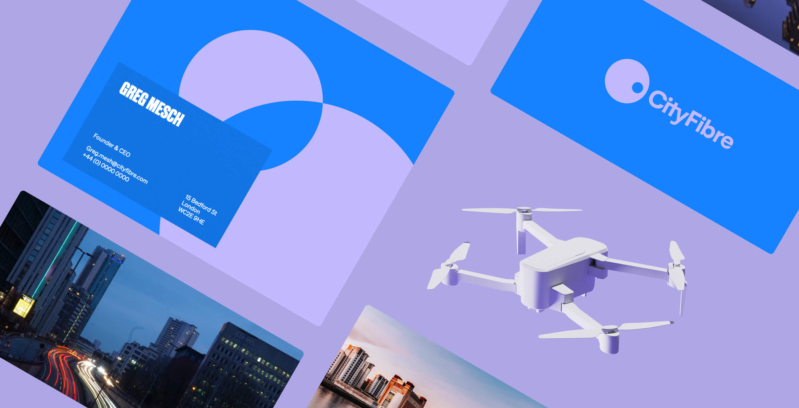
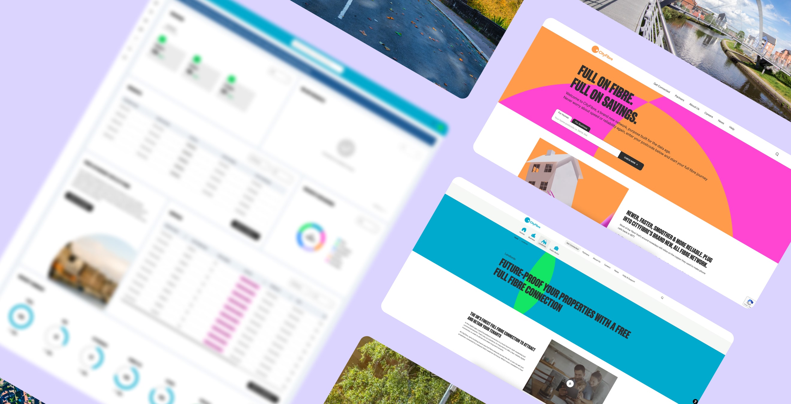
I started by rebuilding the design system in Figma around the new guidelines, then redesigned every block of the website so the whole digital estate held together: marketing site, portal, landing pages, emails.
The neon-dominated colour scheme was the hard part. I implemented it while holding AA accessibility, which meant reworking combinations until they passed rather than softening the brand until it was safe.
Alongside the visual work, I made UX changes to the journeys that mattered commercially, including the flow around the postcode availability checker, the tool that tells people whether they can get fibre installed at home.
The 90%
Compared with the same point three months earlier, before the changes went live, 90% more people clicked through Check availability. That is the number I stand behind: clicks on the button that starts the buying journey, not a vague conversion figure. The agency reported it and put it in front of prospective clients.
That result helped the agency win Hyperoptic, another broadband provider, as a new client. The work sold the work.
What else shipped
The design system was built to match the developer toolset, CraftCMS and Tailwind CSS, so what I designed was what got built. One quieter number from that: the bounce rate on design tickets in Jira fell from about 15% to about 5%, a 95% right-first-time rate, because the tickets were detailed and well documented. It is an agency handover metric, so it sits here as a footnote, not the headline.
Conclusion
A rebrand only counts if the journeys underneath it work. This one moved a commercial number the client could see, and it won the agency its next client. That is the standard I hold brand work to.