
The problem
CityFibre is the UK's second-largest fibre broadband infrastructure provider. It had a new brand from another agency and two products that needed to work with it: a marketing site where people check whether they can get fibre, and a B2B portal that ISPs such as Vodafone, TalkTalk and Zen use to book engineers for installation surveys. The brand had to work across every digital surface and stay accessible, while standing apart from BT and Virgin Media. I also needed to find out what was getting in users' way.
Role and team
I was lead designer for CityFibre at DawsonAndrews. Another agency designed the identity. I redesigned the marketing site, the B2B portal, campaign landing pages and emails, and built the Figma design system the developers worked from.
I worked with three front-end developers, a larger back-end team, a PM, and the agency that created the brand. For the portal research I also led a cross-functional team of PMs, developers and designers.
Key decisions
The homepage opens on the postcode field
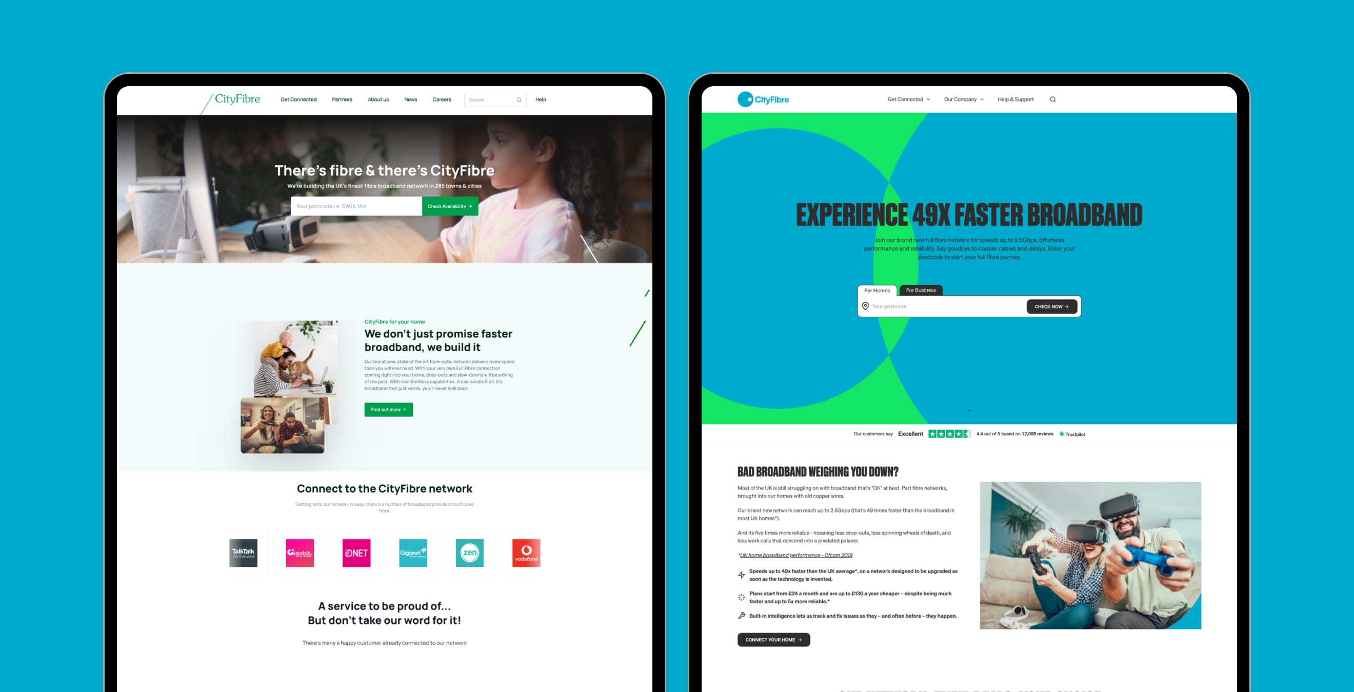
Mouseflow recordings showed people landing on the homepage and scrolling down instead of using the postcode checker. The animated imagery just below the header was pulling them away. I redesigned the first screen so it opens full height with only the postcode field in the middle. Postcode checks rose 90% compared with the month before launch.
The portal redesign started with research
Before designing anything for the B2B portal, I ran research. We held a feedback day at CityFibre's offices with 40 people who use the portal. I led a team of PMs, developers and designers through it and gave them the guidelines, survey links, usability tests and card sorting exercises they needed to run. The Typeform and Figma survey walked users through the live portal. Together with the card sorting and in-person interviews, it produced 1,400+ data points.
The findings drove a complete overhaul of the portal's UX using the new brand. When we re-tested, satisfaction scores went from 4/10 to 8/10 across all sections. In-person interviews showed the same improvement.

The design system matched the developers' stack
I built the Figma design system to match the developers' CraftCMS and Tailwind setup and put together a handoff around it. What I designed was what got built. Developers understood the designs better, and QA could check builds against them more easily. Design tickets sent back for being built incorrectly fell from 15% to 5%, a drop of 10 percentage points. That meant fewer questions and less rework.
The neon palette had to pass AA contrast
The brand used a neon-heavy colour scheme. I kept it while meeting AA accessibility on the website and other digital surfaces.

The result
Postcode checks rose 90%, portal satisfaction doubled from 4/10 to 8/10, and developer send-backs fell from 15% to 5%.
A senior contact at CityFibre, with whom the agency had built a relationship through this work, brought Hyperoptic to DawsonAndrews for further contracts. That account helped the agency hire nine more people. I attribute part of that to the design work.
How I used AI
I used ChatGPT, which was in its early versions at the time and available to our team, to index the research data from the feedback day. Sorting 1,400+ individual results by hand would have taken far longer than the project allowed. I had ChatGPT sort and group them, which gave me evidence to base design decisions on. It sped up both design and development.
Looking back
I would ask my manager and PM for more support in planning meetings and developer calls. I was covering too many priorities at once. Working more closely with them would have made things run more smoothly.
