
Context
At Perforce I am the product design lead for P4 DAM, a digital asset management product for games, film, and VFX. Customers include Electronic Arts, Pinewood Studios, Xbox Game Studios, and Meta.
P4 DAM sits on Perforce version control. Studios store large libraries of 3D models, textures, and media. People need to find a file, see where they are in the folder tree, preview it, and decide if it is ready for review. When those steps are slow or unclear, they fall back to specialist tools.
I owned the day-to-day product experience: first screen, search and filters, folder navigation, and asset review.
Why this work existed
Sales. Competitors’ UX was catching up thanks to AI being widely available so I needed to move fast and stay ahead. On sales calls, in internal use, and in engineer Slack channels, people used the browser back button or bookmarks instead of the product’s navigation. I noticed they struggled to navigate around the product. Users complained about lack of visibility and a poor information architecture.
The old concept tried to be a DAM that did everything. I cut that back. Get people to the asset, then let them manage it.
What changed
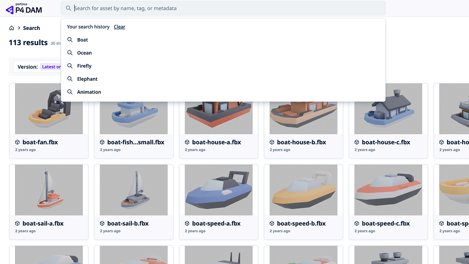
Search history
| Problem | Search had no memory. Users re-typed queries and re-applied filters after every navigation step. |
|---|---|
| Design change | Persistent recent searches and saved filter states on the search bar. |
| Result | Repeat searches dropped to one click, about 15 to 20 seconds saved per lookup. |
Advanced filtering
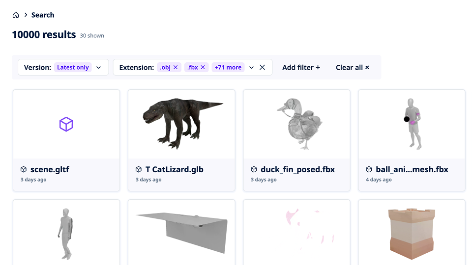
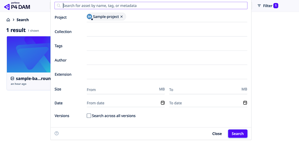
| Problem | Active filters were hard to see and easy to lose, especially date ranges and metadata tags. |
|---|---|
| Design change | Active selections stay visible above results with one-click removal. |
| Result | Users can see, adjust, and clear filters without resetting the search. |
Breadcrumbs
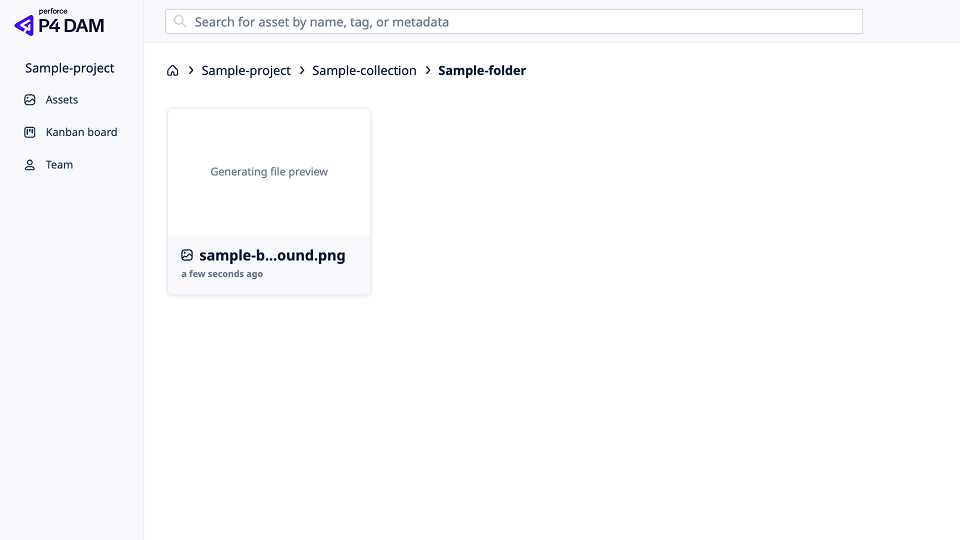
| Problem | Deep, inconsistent folder trees pushed people onto browser back buttons and bookmarks. |
|---|---|
| Design change | One breadcrumb pattern across the product. |
| Result | Less reliance on browser navigation. Fewer people lost in nested folders. |
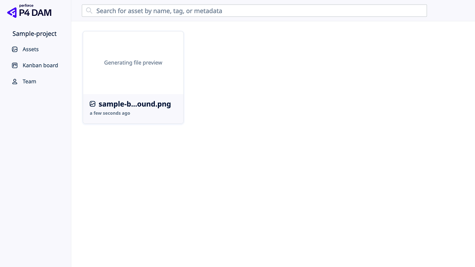
Previewing assets
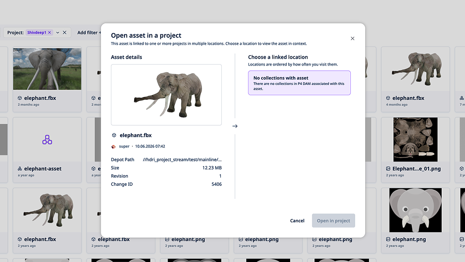
| Problem | Assets in multiple projects often opened in the wrong project. Artists closed the file and switched workspaces by hand. |
|---|---|
| Design change | The preview drawer lets users pick the target project before opening. |
| Result | Fewer wrong-project opens across shared libraries. |
Dashboard
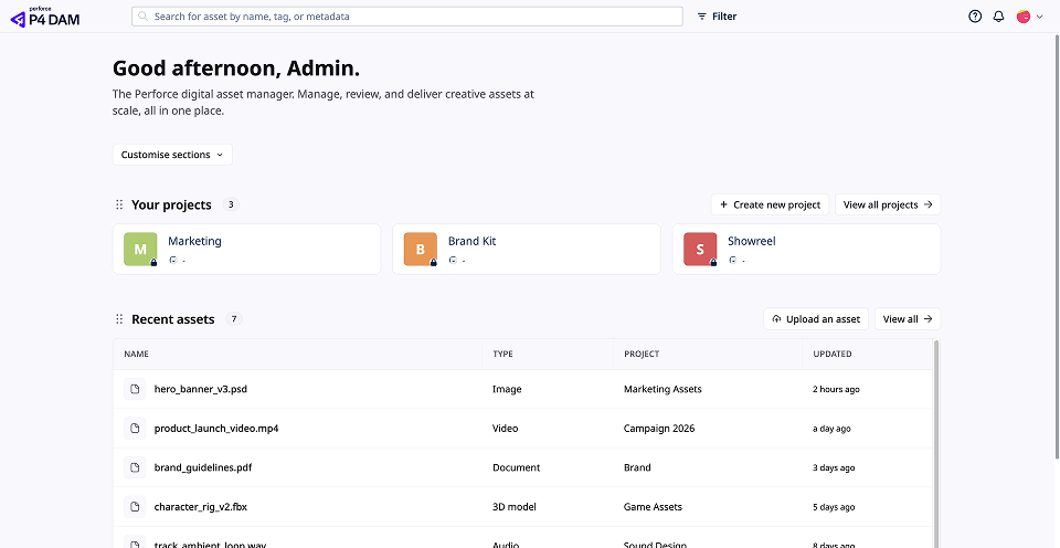
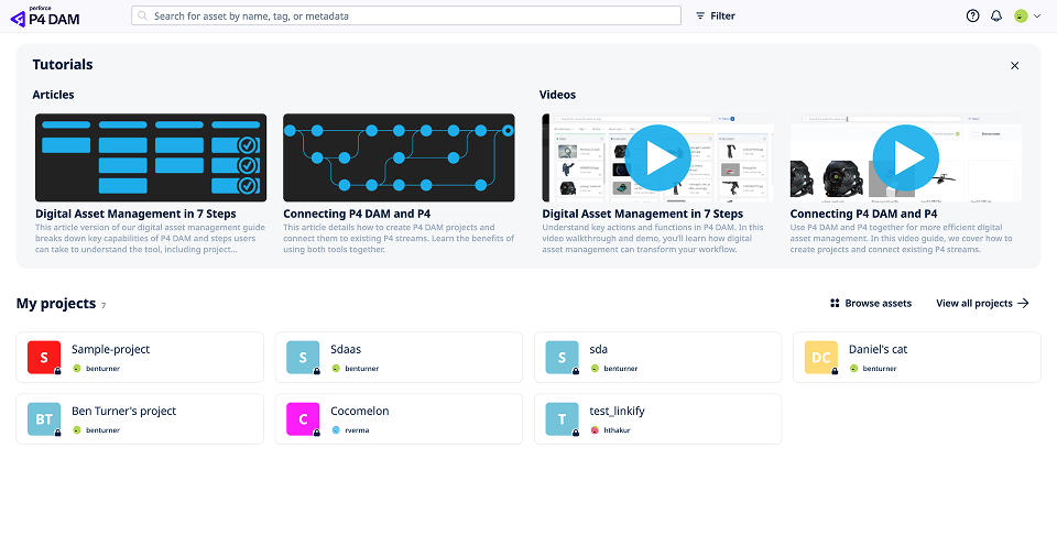
| Problem | The landing page was full of static widgets that did not help people start work. |
|---|---|
| Design change | Recent files, active reviews, and search entry points up front. |
| Result | Steps to an active file cut from four clicks to one. |
Impact
Core navigation fixes made the library faster and easier to trust. Artists find files, stay oriented in deep folders, and move assets through review without fighting the product. These core quality of life changes made the product stand out amongst competitors, with customers noting that it improved their experience.
